
Latest Version
Version
1.2025.3
1.2025.3
Update
June 04, 2025
June 04, 2025
Developer
BOLT UIX
BOLT UIX
Categories
Education
Education
Platforms
Android
Android
Downloads
0
0
License
Free
Free
Package Name
io.materialdesign.catalog
io.materialdesign.catalog
Report
Report a Problem
Report a Problem
More About Material Design Components
M3 Catalog 🚀
This app is for developer demo purposes.
📚 Source Code: GitHub - Material Design Components
https://github.com/boltuix-store/Material-Design-Components
📖 Documentation: Material 3 Guidelines 2025
https://www.boltuix.com/2025/06/material-3-guidelines-2025.html
Material is an adaptable system of guidelines, components, and tools that support the best practices of user interface design. Backed by open-source code, Material streamlines collaboration between designers and developers, helping teams quickly build beautiful products. 🌟
Components 🛠️
Material Components are interactive building blocks for creating a user interface.
Here's the comprehensive list with added components:
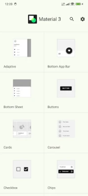
* Adaptive 🖥️: Flexible layouts for various screen sizes
* App Bars: Bottom 📱: Navigation and action bars at the screen bottom
* App Bars: Top 📍: Navigation bars at the top of the screen
* Backdrop 🎨: Layered content with a front and back view
* Badges 🔔: Badges for notifications or status on UI elements (BadgeDrawable)
* Banners 📢: Temporary messages for user attention
* Bottom Navigation 🧭: Switch between UI views at the bottom
* Bottom Sheets ⬇️: Secondary content anchored to the bottom of the screen
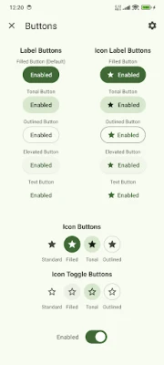
* Buttons 👆: Core components for triggering actions in a UI
* Buttons: Floating Action Button (FAB) ➕: Floating action buttons for primary actions
* FAB Menus 🔄: Menus expanding from FABs for related actions
* Cards 🗂️: Display content and actions for a single subject
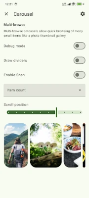
* Carousel 🎠: Scrollable collection of items on and off screen
* Checkboxes ✅: Select one or more items or toggle on/off
* Chips 🏷️: Enter info, make selections, filter, or trigger actions
* Data Tables 📊: Organize and display structured data
* Date Pickers 📅: Select a date or range of dates
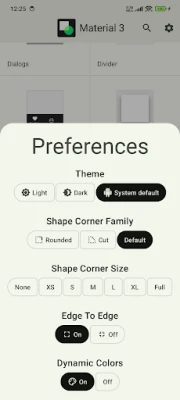
* Dialogs ❗: Important prompts in a user flow
* Dividers ➖: Thin lines to group content in containers
* Docked Toolbar ⚓: Fixed toolbars for frequent actions
* Floating Toolbar 🛠️: Dynamic toolbars for contextual actions
* Icon and Segmented Buttons 🖼️: Buttons with icons or segmented options for interaction
* Image Lists 🖼️: Grid or list of images
* Lists 📋: Vertical lists for content display
* Loading Indicators 🔄: Visual cues for short loading processes
* MaterialTextView ✍️: Enhanced text display component for Material 3
* Menus 📜: Display a list of choices on a temporary surface
* Navigation Drawer 📂: Switch between UI views on larger devices
* Navigation Rail 🚆: Switch between UI views on mid-sized devices
* Progress Indicators ⏳: Show unspecified wait times or process duration
* Radio Buttons 🔘: Select one option from a set
* Search Bar 🔍: Enter keywords or phrases for relevant information
* Selection Controls 🎚️: Manage user selections (checkboxes, radio buttons, switches)
* Sheets: Bottom 📄: Secondary content at the screen bottom
* Sheets: Side 📑: Secondary content anchored to the side of the screen
* Side Sheets 📘: Secondary content anchored to the side
* Sliders 🎚️: Make selections from a range of values
* Snackbars 🔔: Brief updates about app processes at screen bottom
* Switches 🔄: Toggle the selection of an item on or off
* Tabs 📑: Organize content across different screens and views
* Text Fields ✍️: Allow users to enter and edit text in a UI
* Time Pickers ⏰: Help users select and set a specific time
* Tooltips 💡: Brief descriptions for UI elements
🚀 Now Available on CodeCanyon
Purchase the Kotlin version of Material UIX - your ultimate toolkit for crafting sleek, modern, and responsive user interfaces.
Modern App Template – A Responsive and Customizable UI Kit for:
* Jetpack Compose
* Android Kotlin
* Flutter
👉 Get it on CodeCanyon
https://codecanyon.net/user/boltuix
📚 Source Code: GitHub - Material Design Components
https://github.com/boltuix-store/Material-Design-Components
📖 Documentation: Material 3 Guidelines 2025
https://www.boltuix.com/2025/06/material-3-guidelines-2025.html
Material is an adaptable system of guidelines, components, and tools that support the best practices of user interface design. Backed by open-source code, Material streamlines collaboration between designers and developers, helping teams quickly build beautiful products. 🌟
Components 🛠️
Material Components are interactive building blocks for creating a user interface.
Here's the comprehensive list with added components:
* Adaptive 🖥️: Flexible layouts for various screen sizes
* App Bars: Bottom 📱: Navigation and action bars at the screen bottom
* App Bars: Top 📍: Navigation bars at the top of the screen
* Backdrop 🎨: Layered content with a front and back view
* Badges 🔔: Badges for notifications or status on UI elements (BadgeDrawable)
* Banners 📢: Temporary messages for user attention
* Bottom Navigation 🧭: Switch between UI views at the bottom
* Bottom Sheets ⬇️: Secondary content anchored to the bottom of the screen
* Buttons 👆: Core components for triggering actions in a UI
* Buttons: Floating Action Button (FAB) ➕: Floating action buttons for primary actions
* FAB Menus 🔄: Menus expanding from FABs for related actions
* Cards 🗂️: Display content and actions for a single subject
* Carousel 🎠: Scrollable collection of items on and off screen
* Checkboxes ✅: Select one or more items or toggle on/off
* Chips 🏷️: Enter info, make selections, filter, or trigger actions
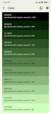
* Data Tables 📊: Organize and display structured data
* Date Pickers 📅: Select a date or range of dates
* Dialogs ❗: Important prompts in a user flow
* Dividers ➖: Thin lines to group content in containers
* Docked Toolbar ⚓: Fixed toolbars for frequent actions
* Floating Toolbar 🛠️: Dynamic toolbars for contextual actions
* Icon and Segmented Buttons 🖼️: Buttons with icons or segmented options for interaction
* Image Lists 🖼️: Grid or list of images
* Lists 📋: Vertical lists for content display
* Loading Indicators 🔄: Visual cues for short loading processes
* MaterialTextView ✍️: Enhanced text display component for Material 3
* Menus 📜: Display a list of choices on a temporary surface
* Navigation Drawer 📂: Switch between UI views on larger devices
* Navigation Rail 🚆: Switch between UI views on mid-sized devices
* Progress Indicators ⏳: Show unspecified wait times or process duration
* Radio Buttons 🔘: Select one option from a set
* Search Bar 🔍: Enter keywords or phrases for relevant information
* Selection Controls 🎚️: Manage user selections (checkboxes, radio buttons, switches)
* Sheets: Bottom 📄: Secondary content at the screen bottom
* Sheets: Side 📑: Secondary content anchored to the side of the screen
* Side Sheets 📘: Secondary content anchored to the side
* Sliders 🎚️: Make selections from a range of values
* Snackbars 🔔: Brief updates about app processes at screen bottom
* Switches 🔄: Toggle the selection of an item on or off
* Tabs 📑: Organize content across different screens and views
* Text Fields ✍️: Allow users to enter and edit text in a UI
* Time Pickers ⏰: Help users select and set a specific time
* Tooltips 💡: Brief descriptions for UI elements
🚀 Now Available on CodeCanyon
Purchase the Kotlin version of Material UIX - your ultimate toolkit for crafting sleek, modern, and responsive user interfaces.
Modern App Template – A Responsive and Customizable UI Kit for:
* Jetpack Compose
* Android Kotlin
* Flutter
👉 Get it on CodeCanyon
https://codecanyon.net/user/boltuix
Rate the App
Add Comment & Review
User Reviews
Based on 0 reviews
No reviews added yet.
Comments will not be approved to be posted if they are SPAM, abusive, off-topic, use profanity, contain a personal attack, or promote hate of any kind.


More »

Popular Apps
Crazy Gears Box: Connect cogsCellcrowd

Quartz ComponentsCircuitloop

Fishing Points - Fishing AppFishing Points d.o.o.
Fotor - AI Photo EditorAI Art Photo Editor | Everimaging Ltd.

Learn Ethical HackingCoddy Software Solutions
InstaSize: AI Photo EditorInstasize, Inc.
Cell to Singularity: EvolutionComputerLunch

Avast Antivirus & SecurityAvast Software

Fishbrain - Fishing AppFishbrain
Open Food FactsOpen Food Facts
More »
Editor's Choice

Idle Weapon ShopHello Games Team
Weaphones™ Gun Sim Vol1 ArmoryOranginalPlan
Weapon Quiz: Guns & AmmunitionBarneyGames

Weaphones™ Firearms Sim Vol 2OranginalPlan

MessengerMeta Platforms, Inc.

Google ChatGoogle LLC

Cigna MailCitrix

Infomaniak MailInfomaniak

Southwest Tennessee EMCCentral Service Association

Common AppThe Common Application